The idea here was to append a density plot to the left of my main plot (an area-rectangle plot in this case. Side note, need to find a better name for that).
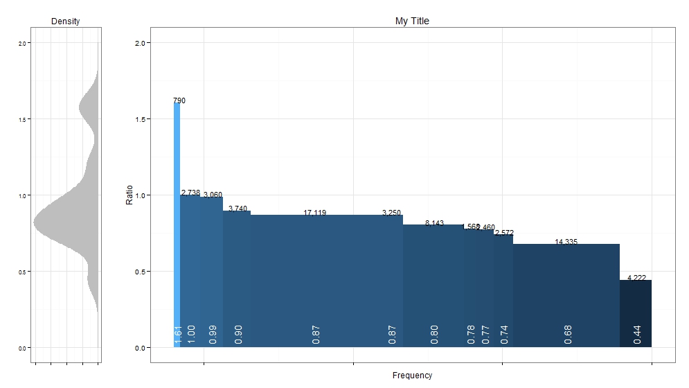
It was easy enough to generate both plots, but concatenating them was a challenge. I found this very well-written stackoverflow question on the topic: http://stackoverflow.com/questions/14743060/r-ggplot-graphs-sharing-the-same-y-axis-but-with-different-x-axis-scales
Seemed like gridExtra::grid.arrange() was the best way to go rahter than ggplot’s facet_wrap or facet_grid (given that I wanted the two charts to have different widths). I was able to plot the two graphs next to one another with the right spacing, but getting them to share a common y-axis was a challenge. I needed better control over the graphing parameters. I posted the question to stackoverflow: http://stackoverflow.com/questions/24765686/plotting-2-different-ggplot2-charts-with-the-same-y-axis
Turns out ggplot_gtable was exactly what I needed. From ?ggplot_gtable help text: “This function builds all grobs necessary for displaying the plot, and stores them in a special data structure called a gtable. This object is amenable to programmatic manipulation, should you want to (e.g.) make the legend box 2 cm wide, or combine multiple plots into a single display, preserving aspect ratios across the plots.”
Fully reproducible example:
rm(list=ls())
library(ggplot2)
library(gridExtra)
library(dplyr)

df<-structure(list(ratio = c(0.442, 0.679, 0.74, 0.773, 0.777,
                                 0.8036, 0.87, 0.871, 0.895, 0.986, 1.003, 1.2054, 1.546, 1.6072
), width = c(4222L, 14335L, 2572L, 2460L, 1568L, 8143L, 3250L,
             17119L, 3740L, 3060L, 2738L, 1L, 1L, 790L)
, w = c(4222L, 18557L, 21129L, 23589L, 25157L, 33300L, 36550L, 53669L, 57409L, 60469L
        , 63207L, 63208L, 63209L, 63999L)
, wm = c(0L, 4222L, 18557L, 21129L
         , 23589L, 25157L, 33300L, 36550L, 53669L, 57409L, 60469L, 63207L,
         63208L, 63209L)
, wt = c(2111, 11389.5, 19843, 22359, 24373, 29228.5,
         34925, 45109.5, 55539, 58939
         , 61838, 63207.5, 63208.5, 63604)
, mainbuckets = c(" 4,222", "14,335", " 2,572", " 2,460", " 1,568",
                " 8,143", " 3,250", "17,119", " 3,740", " 3,060", " 2,738",
                "", "", "   790")
, mainbucketsULR = c("0.44", "0.68", "0.74"
                     , "0.77", "0.78", "0.80", "0.87", "0.87", "0.90", "0.99", "1.00",
                     "", "", "1.61"))
, .Names = c("ratio", "width", "w", "wm",
             "wt", "mainbuckets", "mainbucketsULR")
, class = c("tbl_df", "tbl",
"data.frame"), row.names = c(NA, -14L))

textsize<-4

p1<-
  ggplot(df, aes(ymin=0)) +
  geom_rect(aes(xmin = wm, xmax = w, ymax = ratio, fill = ratio)) +
  scale_x_reverse() +
  geom_text(aes(x = wt, y = ratio+0.02, label = mainbuckets),size=textsize,color="black") +
  geom_text(aes(x = wt, y = 0.02, label = mainbucketsULR),size=textsize+1,color="white",hjust=0,angle=90) +
  xlab("Frequency") +
  ylab("Ratio") +
  ggtitle(paste("My Title")) +
  theme_bw() +
  theme(legend.position = "none"
        ,axis.text.x=element_blank())


p2<-ggplot(df, aes(ratio,fill=width,ymin=0)) + geom_density(color="grey",fill="grey") +
  ggtitle("Density") +
  xlab("") +
  ylab("") +
  theme_bw() +
  coord_flip()+
  scale_y_reverse() +
  theme(text=element_text(size=10)
        ,axis.text.x=element_blank()
        ,legend.position="none"
        #,axis.text.y=element_blank()
  )


limits <- c(0, 2)
breaks <- seq(limits[1], limits[2], by=.5)

# assign common axis to both plots
p1.common.y <- p1 + scale_y_continuous(limits=limits, breaks=breaks)
p2.common.y <- p2 + scale_x_continuous(limits=limits, breaks=breaks)

# At this point, they have the same axis, but the axis lengths are unequal, so ...

# build the plots
p1.common.y <- ggplot_gtable(ggplot_build(p1.common.y))
p2.common.y <- ggplot_gtable(ggplot_build(p2.common.y))

# copy the plot height from p1 to p2
p2.common.y$heights <- p1.common.y$heights

grid.arrange(p2.common.y,p1.common.y,ncol=2,widths=c(1,5))
Posted the above to github here: https://github.com/timkiely/dualggplot
Much thanks to Matthew Plourde for the stackoverflow answer.
Update: Just looked up “variable width bar charts” and, though there is some confusion/disagreement, this appears to be known as a “Cascade Chart”. Cool.
