Category Archives: Visualization

Using a “Slope Graph” to Visualize Predicted Rank vs. Actual

“Slope Graphs” are gaining some popularity thanks to Edward Tufte: http://www.edwardtufte.com/bboard/q-and-a-fetch-msg?msg_id=0003nk

An Example of Edward Tufte's "Slope Graph"

An Example of Edward Tufte’s “Slope Graph”

ggplot2 makes Slope Graphs easy to plot via the geom_path() function.

The below code plots rounds 1, 2 and 3 of the 2012 Masters tournament, scraped from ESPN.com at the time of the competition on a Slope graph. Note that I’ve displayed the information quantitatively, i.e., the golfer’s actual scores over the 3 Rounds. This doesn’t align with the spirit of the Slope graph, which is better for qualitative views of data. In a future version it would be better to calculate relative rank on each day, then display the change. It works out OK here because golf scores seem to remain within a relatively stable range.


library(reshape)
library(ggplot2)

Data.masters=structure(list(PLAYER = structure(1:3, .Label = c("Round 1",
"Round 2", "Round 3"), class = "factor"), Marc.Leishman = c(66L,
66L, 69L), Fred.Couples = c(68L, 71L, 73L), Jim.Furyk = c(69L,
69L, 70L), Tiger.Woods = c(70L, 70L, 71L), Angel.Cabrera = c(71L,
69L, 68L), John.Senden = c(72L, 72L, 67L), Adam.Scott = c(69L,
72L, 78L), Jason.Dufner = c(72L, 69L, 64L), David.Lynn = c(68L,
73L, 71L), Lee.Westwood = c(70L, 70L, 80L), Justin.Rose = c(70L,
70L, 70L), K.J..Choi = c(70L, 70L, 74L), Rickie.Fowler = c(68L,
68L, 76L), Jason.Day = c(70L, 70L, 73L)), .Names = c("PLAYER",
"Marc.Leishman", "Fred.Couples", "Jim.Furyk", "Tiger.Woods",
"Angel.Cabrera", "John.Senden", "Adam.Scott", "Jason.Dufner",
"David.Lynn", "Lee.Westwood", "Justin.Rose", "K.J..Choi", "Rickie.Fowler",
"Jason.Day"), row.names = c(NA, 3L), class = "data.frame")

df.set.m <- melt(Data.masters, id.var = c("PLAYER"))

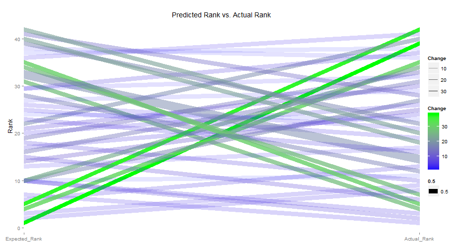
ggplot(df.set.m, aes(PLAYER, value, group = variable)) +
theme(panel.background = element_rect(fill = 'white', colour = NULL)
,panel.grid.major = element_line(color="white")
,panel.grid.minor = element_line(color="white")) +
scale_x_discrete(expand = c(0, 0))+
geom_path(lineend="round",aes(color=variable
#,size=.5
#,alpha=Change
)
)+
xlab(NULL) +
ylab("Rank") +
ggtitle("Predicted Rank vs. Actual Rank")

SlopeGraphExampleMasters

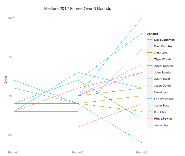
An interesting annotation: it seems that the first day of golf has relatively less variance in scores than the last day. Notice how in Round 3, the scores really start to separate. This could also be due to some occurrence that day (i.e., weather), but the graph at least suggests that in order to do well in the masters, consistency and momentum play a role.

A few more examples, here plotting Predicted Rank of a GBM model vs. Actual Rank:

SlopeGraphExampleRedBlack

Dual ggplot2: different chart, same y-axis

The idea here was to append a density plot to the left of my main plot (an area-rectangle plot in this case. Side note, need to find a better name for that).

dualggplotExampleImage

It was easy enough to generate both plots, but concatenating them was a challenge. I found this very well-written stackoverflow question on the topic: http://stackoverflow.com/questions/14743060/r-ggplot-graphs-sharing-the-same-y-axis-but-with-different-x-axis-scales

Seemed like gridExtra::grid.arrange() was the best way to go rahter than ggplot’s facet_wrap or facet_grid (given that I wanted the two charts to have different widths). I was able to plot the two graphs next to one another with the right spacing, but getting them to share a common y-axis was a challenge. I needed better control over the graphing parameters. I posted the question to stackoverflow: http://stackoverflow.com/questions/24765686/plotting-2-different-ggplot2-charts-with-the-same-y-axis

Turns out ggplot_gtable was exactly what I needed. From ?ggplot_gtable help text: “This function builds all grobs necessary for displaying the plot, and stores them in a special data structure called a gtable. This object is amenable to programmatic manipulation, should you want to (e.g.) make the legend box 2 cm wide, or combine multiple plots into a single display, preserving aspect ratios across the plots.”

Fully reproducible example:

rm(list=ls())
library(ggplot2)
library(gridExtra)
library(dplyr)

df<-structure(list(ratio = c(0.442, 0.679, 0.74, 0.773, 0.777, 
                                 0.8036, 0.87, 0.871, 0.895, 0.986, 1.003, 1.2054, 1.546, 1.6072
), width = c(4222L, 14335L, 2572L, 2460L, 1568L, 8143L, 3250L, 
             17119L, 3740L, 3060L, 2738L, 1L, 1L, 790L)
, w = c(4222L, 18557L, 21129L, 23589L, 25157L, 33300L, 36550L, 53669L, 57409L, 60469L
        , 63207L, 63208L, 63209L, 63999L)
, wm = c(0L, 4222L, 18557L, 21129L
         , 23589L, 25157L, 33300L, 36550L, 53669L, 57409L, 60469L, 63207L, 
         63208L, 63209L)
, wt = c(2111, 11389.5, 19843, 22359, 24373, 29228.5, 
         34925, 45109.5, 55539, 58939
         , 61838, 63207.5, 63208.5, 63604) 
, mainbuckets = c(" 4,222", "14,335", " 2,572", " 2,460", " 1,568", 
                " 8,143", " 3,250", "17,119", " 3,740", " 3,060", " 2,738", 
                "", "", "   790")
, mainbucketsULR = c("0.44", "0.68", "0.74"
                     , "0.77", "0.78", "0.80", "0.87", "0.87", "0.90", "0.99", "1.00", 
                     "", "", "1.61"))
, .Names = c("ratio", "width", "w", "wm", 
             "wt", "mainbuckets", "mainbucketsULR")
, class = c("tbl_df", "tbl", 
"data.frame"), row.names = c(NA, -14L))

textsize<-4

p1<-
  ggplot(df, aes(ymin=0)) + 
  geom_rect(aes(xmin = wm, xmax = w, ymax = ratio, fill = ratio)) +
  scale_x_reverse() +
  geom_text(aes(x = wt, y = ratio+0.02, label = mainbuckets),size=textsize,color="black") +
  geom_text(aes(x = wt, y = 0.02, label = mainbucketsULR),size=textsize+1,color="white",hjust=0,angle=90) +
  xlab("Frequency") +
  ylab("Ratio") +
  ggtitle(paste("My Title")) +
  theme_bw() +
  theme(legend.position = "none"
        ,axis.text.x=element_blank())


p2<-ggplot(df, aes(ratio,fill=width,ymin=0)) + geom_density(color="grey",fill="grey") +
  ggtitle("Density") +
  xlab("") +
  ylab("") +
  theme_bw() +
  coord_flip()+
  scale_y_reverse() +
  theme(text=element_text(size=10)
        ,axis.text.x=element_blank()
        ,legend.position="none"
        #,axis.text.y=element_blank()
  )


limits <- c(0, 2)
breaks <- seq(limits[1], limits[2], by=.5)

# assign common axis to both plots
p1.common.y <- p1 + scale_y_continuous(limits=limits, breaks=breaks)
p2.common.y <- p2 + scale_x_continuous(limits=limits, breaks=breaks)

# At this point, they have the same axis, but the axis lengths are unequal, so ...

# build the plots 
p1.common.y <- ggplot_gtable(ggplot_build(p1.common.y))
p2.common.y <- ggplot_gtable(ggplot_build(p2.common.y))

# copy the plot height from p1 to p2
p2.common.y$heights <- p1.common.y$heights

grid.arrange(p2.common.y,p1.common.y,ncol=2,widths=c(1,5))

Posted the above to github here: https://github.com/timkiely/dualggplot

Much thanks to Matthew Plourde for the stackoverflow answer.

Update: Just looked up “variable width bar charts” and, though there is some confusion/disagreement, this appears to be known as a “Cascade Chart”. Cool.

Rapid Visualization: ggplot plus dplyr

A typical dplyr statment includes a chain of group by statements, summarization stats, a mutate clause to derive a new variable, sorting using arrange and possibly a filter statement (maybe not in that order):

dplyr.df1 <- data = df1 %.% group_by(Var1, Var2) %.% summarize(summary1=sum(Var3) %.% mutate(NewVar1=(Var4/Var5)) %.% filter(Var6!=min(Var6) %.% arrange(Var7)

In addition, ggplot has some powerful stratification tools, such as facet_wrap() and facet_grid(). In order to get the best plot, it’s necessary to re-group and calculate variables based on the cut you are trying to achieve.

Enter: a structure for using dplyr from directly within ggplot by specifying the “data” argument as a chained dplyr statement. By tweaking various parameters, the following allows you to rapidly create various cuts and plots of the same data.

library(dplyr)
library(ggplot2)

ggplot(data=loss.df2 %.%
         group_by(Area, POL_YEAR,PRODUCT_NAME) %.%
         summarize(Losses_Paid=sum(LOSS_PAID)
                   ,Earned_USD=sum(NET_EARNED)
                   ,Net_P=sum(NET_P)
                   ,Net_IB=sum(NET_IB)
                   ,Net_Profit=sum(NET_PROFIT)
         )%.%
         mutate(Marginal_Earned=(Net_USD/Earned_USD)
                , Marginal_Earned = ifelse(is.na(Marginal_Earned),0,Marginal_Earned)
                , Marginal_Earned = ifelse(!is.finite(Marginal_Earned),0,Marginal_Earned)
         )%.%
         filter(Marginal_Earned!=min(Marginal_Earned)) #removes the lowest value (for outliers)
      
 #end the dplyr statement, continue with ggplot syntax

        , aes(x=PRODUCT_NAME
             , y=Marginal_Earned
             , color
             , group=Area
             , fill=Area)
       ) + 
  
  geom_bar(stat="identity"
           , position=position_dodge()
           , size=.5 # Thinner lines
  ) +
  facet_wrap(~POL_YEAR) +
  #facet_grid(. ~ BRANCH) + #same thing as facet_wrap, but in a grid format
  
  scale_fill_hue(name="Area") + # Set legend title
  #ylim(min(df1$Marginal_Earned), max(df1$Marginal_Earned)) +
  xlab("") + 
  ylab("") + # Set axis labels
#  ggtitle("MydplyrChart") + # Set title
  theme(legend.position = "none"
        ,axis.ticks = element_blank()
        , axis.text.x = element_blank()
        , axis.text.y = element_blank()) + 
  coord_flip()

dplyr-ggplot2 Example

dplyr-ggplot2 Example

Also, note the “mutate(Marginal_Earned = ifelse(is.na(Marginal_Earned),0,Marginal_Earned)” statement in the above code. Replaces “NA’s” with zeros. Completely replaces most sub-setting and/or the “replace()” function. I expect to be using a lot of that.

Will continue building this structure out to include text/legend formatting, etc.